

Word Add-in manual
How to install and get the most out of the Bond Add-in for Microsoft Word.
Download
Download the 90-day free trial of the Bond Add-in for Word by clicking the button below.
Download the 90-day free trial
How to install
Double-click the saved file 'download.php?product=word' to install the add-in. You will see the Bond Add-in the next time you open a document in Word.
The Ribbon is initially hidden, in 'Show tabs only' mode.
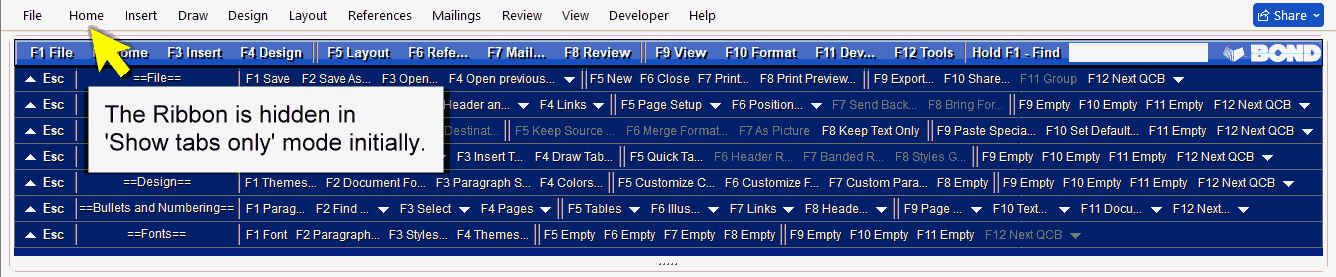
To access Ribbon commands with the mouse, click on a tab title such as 'Insert' or 'Draw'. The relevant Ribbon tab is temporarily displayed.
To permanently display the Ribbon, click any Ribbon tab, click the down arrow in the lower-right corner of the Ribbon to open the Ribbon display menu, then click 'Always show Ribbon'.
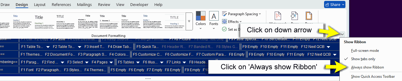
To hide the Ribbon again, click any Ribbon tab, click the down arrow in the lower-right corner, and click 'Show tabs only'.
Standard drop down menus — Easy Function Keys™
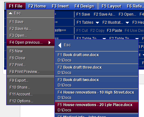
Press the function key of the menu you want. The menu opens; then press the function key of the command you wish to use.
(You can also use the mouse or a touchscreen for every button and command in the Bond Add-in.)
The drop down menus contain the commands from the Ribbon tab of the same name — for example, the 'Home' menu contains the commands in the Ribbon's 'Home' tab.
Dialogue boxes
Press the function key of the command you want, or use the mouse.
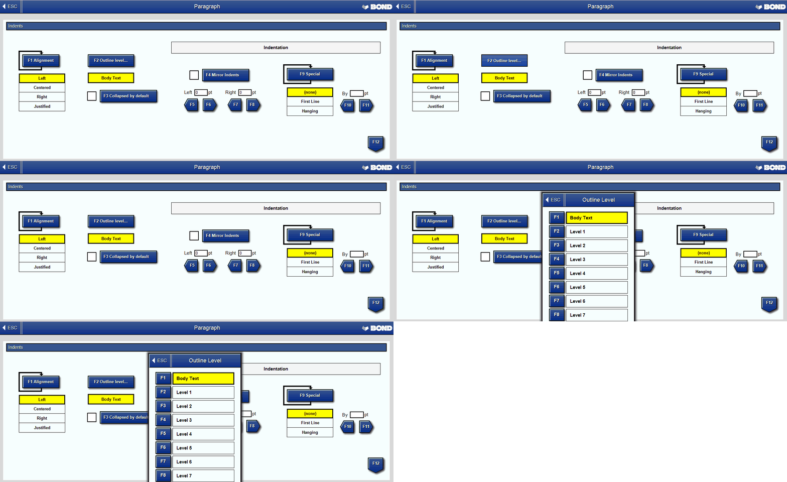
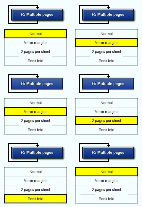
Multi-Toggle Buttons™ have an arrow that loops from the bottom of the button back to the top — press the function key repeatedly until the option you want is selected.
Some dialogue boxes have multiple sub-windows. Press F12 to move to the next sub-window. Press Esc to move to the previous sub-window, or to close the dialogue box from the first sub-window. Press Enter to submit the current settings and close the window.
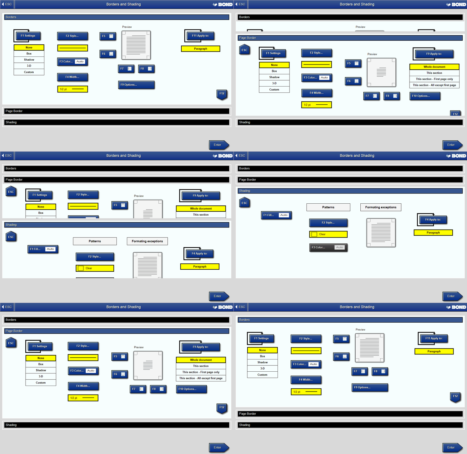
Note: not all Word dialogue boxes are implemented in the Bond Add-in yet.
Quick Command Bars™

The Bond Add-in comes with built-in Quick Command Bars™ (QCBs). To select the first QCB, press F12 F12 (F12 Tools, F12 Go To QCBs). Press F12 for the next QCB, and Esc for the previous QCB or to return to the main menu.
When a QCB is selected, the function keys run the commands on that bar — one-key access to your favourite commands. Each QCB can hold up to 11 commands, on F1–F11.
Edit QCBs by pressing F12 F10 Select QCBs.
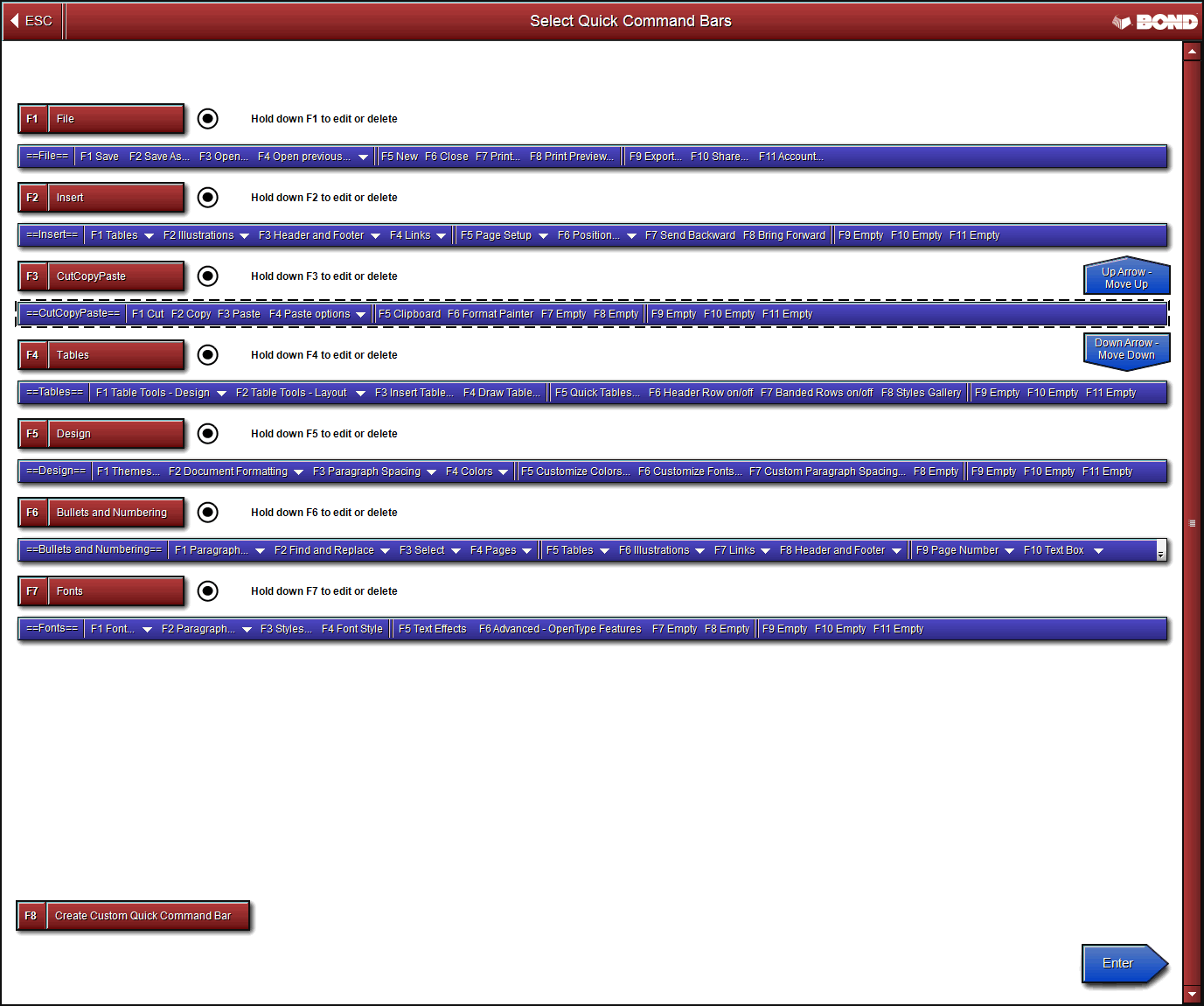
Hold down the function key of the QCB you want to edit — the 'Edit Custom Quick Command Bar' window opens.
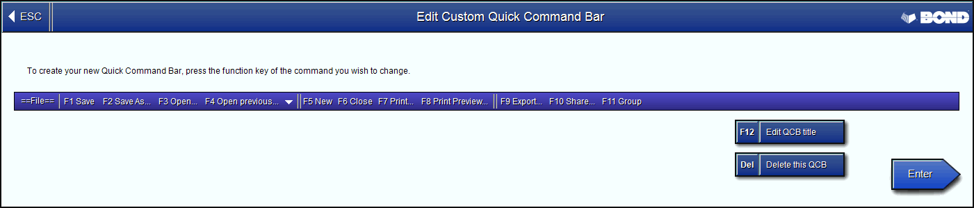
Change a command
Press the function key of the command you wish to change. A copy of the main menu appears at the top of the window. Select the command you want — it flashes yellow. (To select a command that leads to a sub-menu — shown with a right-hand arrow — hold its function key until it flashes yellow.) The menu disappears and the new command is now on the QCB.
Edit the QCB title
Press F12 to change the QCB title. Press Delete to delete the QCB. Press Enter to accept your changes.
Import and export QCBs
To save your QCBs as an XML file, press F12 F6 Export XML. To load a set, press F12 F5 Import XML and choose the file. Warning: importing overwrites the current QCBs, so export them first.
Delete a QCB
Press the Delete button. A window asks you to confirm; press Escape to cancel.
Change QCB order
Press the function key of the QCB you want to move, then the Up or Down arrow. The QCB may deselect (turn grey) on the first press — press its function key again to turn it back on.
Turn QCBs off
Turn off individual QCBs by pressing each one's function key, which clears its radio button and greys it out. Those QCBs are then hidden. Press Enter to accept.
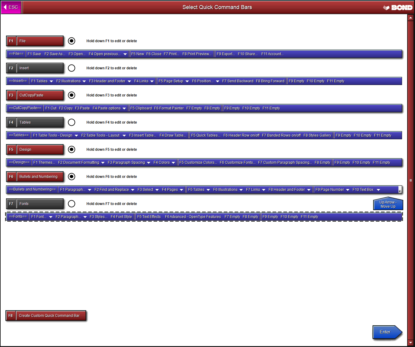
Now only four QCBs are visible.

Keyboard Drop Down Menus™
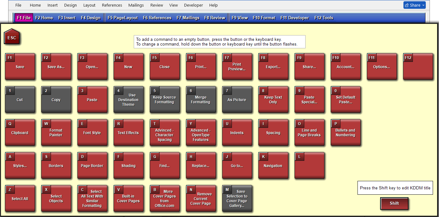
Press F12 F11 'Show KDDM' to switch from the normal drop down menus to the Keyboard Drop Down Menus (KDDM). Press F12 F11 'Hide KDDM' to switch back.
The KDDM uses 48 keyboard keys to run Word commands. To open a KDDM, press its function key. The first two — F1 File and F2 Home — come with commands already attached; you can change any of them and add commands to the F3–F12 KDDMs.
To run a command such as 'Save', press its key. To change the command on a key, hold the key for about a second until it flashes yellow; a copy of the menu bar appears at the top of the KDDM window. To add a command to an empty key, just press it — it flashes yellow and the menu bar appears immediately.
From the menu at the top, select the command you want — it flashes yellow, the menu disappears, and the new command is placed on the key.
(Due to limitations in Microsoft Word, you cannot add a command that leads to a sub-menu / flyout — shown with a right-hand arrow — to the KDDM. You can add flyout menus to Quick Command Bars.)
How to temporarily disable the add-in
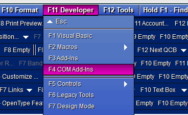
Press F11 F4 Com Add-Ins.
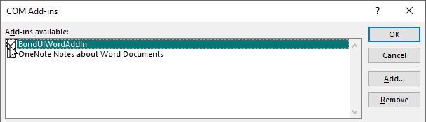
Untick the box for “BondUIWordAddIn” and press OK. The Bond Add-in is now temporarily disabled.
How to enable the add-in again
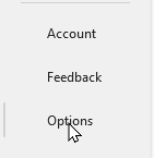
Press the 'File' button at the top-left of the Ribbon, then 'Options' at the bottom-left of the next window.
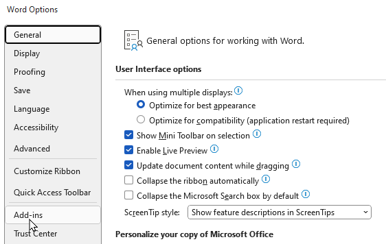
Click 'Add-ins'.
Click the 'Go…' button next to 'Manage: COM Add-ins', near the bottom of the window.
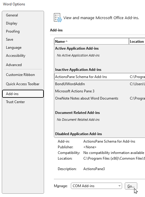
Tick the box for “BondUIWordAddIn” and press OK. The Bond Add-in is enabled again.
How to change colour themes
The Bond Add-in uses the file wdUI.xml for its colour theme, stored at:
C:\Users\YourWindowsUsername\AppData\Local\Adam Bond\The Bond Interface for Microsoft Office\xml\wdUI.xml
It ships with these theme files:
- wdUI - Blue on Grey.xml
- wdUI - Green.xml
- wdUI - Purple.xml
- wdUI - Red on Green.xml
- wdUI - Red on Purple.xml
- wdUI - Red on Teal.xml
- wdUI - TealWithGreenMenu.xml
To switch theme, first close Microsoft Word. Rename the original
wdUI.xml to something else (ideally noting the change) — e.g.
'wdUI - Original - changed to Blue on Grey.xml'. Then rename your chosen theme, e.g.
'wdUI - Blue on Grey.xml', to wdUI.xml, and start Word. The new theme
loads.
How to customise colour themes
First, copy wdUI.xml in Windows Explorer (right-click → Copy, then
right-click → Paste) to create 'wdUI - Copy.xml'. Open the copy in a text editor —
we recommend the free
Microsoft Visual Studio
Community.
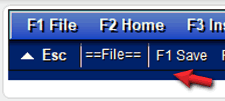
The colour settings run from line 1646 to 1729. Each entry below shows the line, the XML, what it controls, and where it appears.
<part name="backgroundColor" value="#00226A"/>
Background colour.
<part name="foregroundColor" value="#000000"/>
Not used.
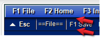
<part name="menuBackgroundStartColor" value="#00226A"/>
<part name="menuBackgroundEndColor" value="#00226A"/>
QCB background gradient — top and bottom colour.
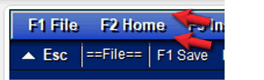
<part name="menuBackgroundStartColorActive" value="#AAAAAA"/>
<part name="menuBackgroundEndColorActive" value="#002b88"/>
Main menu background gradient — top and bottom colour.
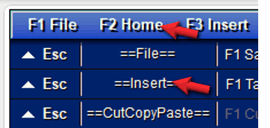
<part name="menuForegroundColor" value="#FFFFEE"/>
All menu text colour.
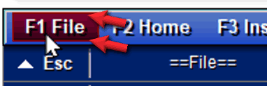
<part name="menuItemSelectedStartColor" value="#85006F"/>
<part name="menuItemSelectedEndColor" value="#EF00C8"/>
Highlighted menu bar gradient — top and bottom colour.
<part name="menuBorderColor" value="#6d6d6d"/>
QCB horizontal separators.
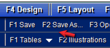
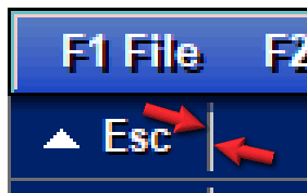
<part name="menuSeparatorInnerColor" value="#606060"/>
<part name="menuSeparatorOuterColor" value="#CCCCCC"/>
QCB vertical bar — left (inner) and right (outer) colour.
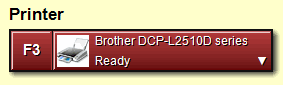
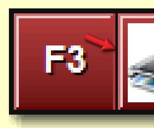
<part name="menuSeparatorInactiveInnerColor" value="#FFFFFF"/>
Vertical bar in the Print dialogue and others.
<part name="menuSeparatorInactiveOuterColor" value="#FFFFFF"/>
Not used.
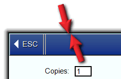
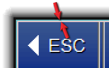
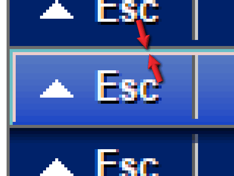
<part name="menuActiveLineStartColor" value="#6BBFC6"/>
<part name="menuActiveLineEndColor" value="#ECCDCD"/>
Dialogue box border — outside (start) and inside (end) colour. Also affects Quick Command Bars.
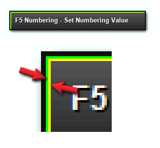
<part name="menuActiveLineInactiveStartColor" value="#0000FF"/>
<part name="menuActiveLineInactiveEndColor" value="#FFFF00"/>
Inactive buttons — outside and inside border colour.
<part name="menuItemBorder" value="#930000"/>
Border of the highlighted menu bar.
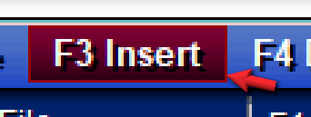
<part name="popupBorderColor" value="#1603B7"/>
Border of the dropdown menu.
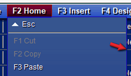
<part name="popupBackgroundStartColor" value="#6a6a6a"/>
<part name="popupBackgroundEndColor" value="#4b4b4b"/>
Inactive dropdown menu background gradient — top and bottom colour.
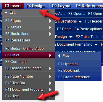
<part name="popupBackgroundStartColorActive" value="#6a6a6a"/>
<part name="popupBackgroundEndColorActive" value="#4b4b4b"/>
Active dropdown menu background gradient — top and bottom colour.
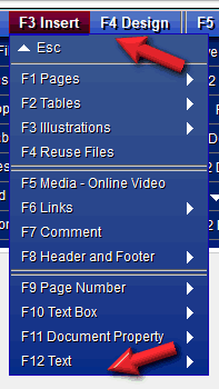
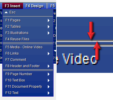
<part name="popupSeparatorInnerColor" value="#FFFFFF"/>
<part name="popupSeparatorOuterColor" value="#000000"/>
Dropdown menu separator bar — top (inner) and bottom (outer) colour.
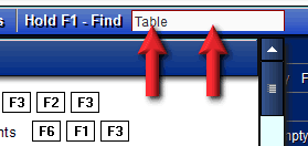
<part name="findTextBoxBackgroundColor" value="#FAFAFA"/>
<part name="findTextBoxForegroundColor" value="#303030"/>
Find box — background and text colour.
<part name="menuBackgroundStartColor" value="#00E000"/>
<part name="menuBackgroundEndColor" value="#00E000"/>
Menu background start and end colour.
<part name="dialogBackgroundColor" value="#f6ffff"/>
<part name="dialogForegroundColor" value="#000000"/>
<part name="dialogBorderColor" value="#000000"/>
Dialogue background, text and border colour.
<part name="dialogCaptionBackgroundStartColor" value="#37568f"/>
<part name="dialogCaptionBackgroundEndColor" value="#002b88"/>
Dialogue box title bar gradient — top and bottom colour.
<part name="dialogCaptionForegroundColor" value="#FFFFFF"/>
Dialogue box title bar text colour.

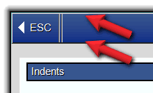
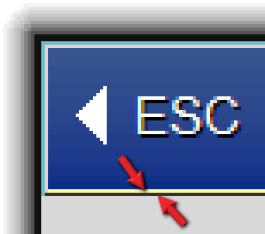
<part name="dialogCaptionBorderInnerColor" value="#202020"/>
<part name="dialogCaptionBorderOuterColor" value="#00E000"/>
Dialogue box title bar bottom bar — colour 1 and 2.
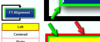
<part name="dialogControlBorderInnerColor" value="#00FF00"/>
<part name="dialogControlBorderOuterColor" value="#FF0000"/>
Multi-Toggle Button border colour (green / red arrows).
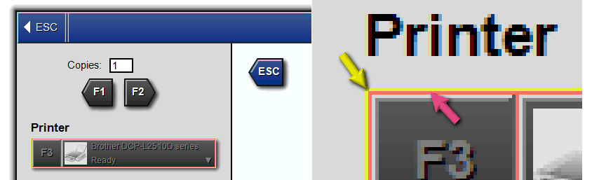
<part name="dialogControlBorderInactiveInnerColor" value="#ff6d6d"/>
<part name="dialogControlBorderInactiveOuterColor" value="#e4f039"/>
Multi-Toggle Button inactive border colours (yellow / pink arrows).
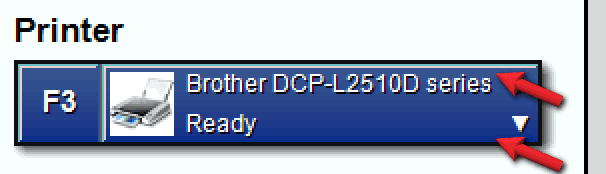
<part name="dialogControlHighlightedBackgroundStartColor" value="#85006F"/>
<part name="dialogControlHighlightedBackgroundEndColor" value="#EF00C8"/>
Dialogue box large button gradient — top and bottom colour.
<part name="dialogControlHighlightedForeColor" value="#F8F8F8"/>
Dialogue box large button function-key text colour.
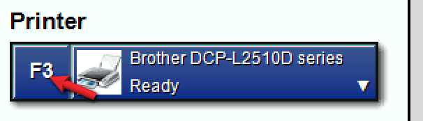
<part name="dialogControlBackgroundStartColor" value="#37568f"/>
<part name="dialogControlBackgroundEndColor" value="#002b88"/>
Dialogue box button gradient — top and bottom colour.
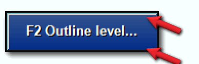
<part name="dialogControlForegroundColor" value="#FFFFFF"/>
Dialogue box button text colour.
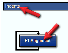
<part name="dialogControlBackgroundStartColor" value="#37568f"/>
<part name="dialogControlBackgroundEndColor" value="#37568f"/>
Dialogue box button top colour.
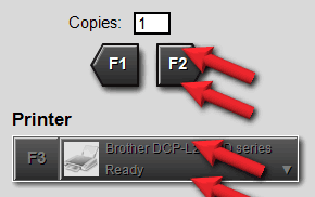
<part name="dialogDashedControlBackgroundStartColor" value="#FF55CE"/>
<part name="dialogDashedControlBackgroundEndColor" value="#DF2F72"/>
Not used.
<part name="shadowColor" value="#00FF00"/>
Dialogue box border shadow colour.
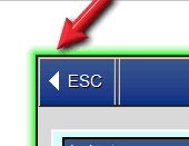
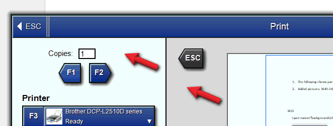
<part name="dialogPanelActiveBackgroundColor" value="#d3fffb"/>
<part name="dialogPanelInactiveBackgroundColor" value="#D9D9D9"/>
Dialogue box active and inactive section background colour.
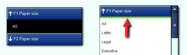
<part name="popupWindowBackgroundColor" value="#b9ffad"/>
Popup window lower border shadow start colour (end colour is fixed black).
<part name="popupWindowForegroundColor" value="#000000"/>
Not used.
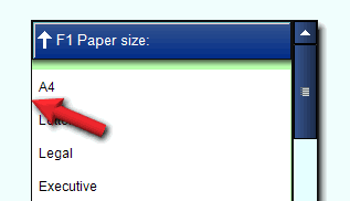
<part name="popupWindowBorderColor" value="#101010"/>
Popup window border colour.
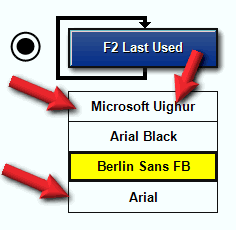
<part name="popupItemBackgroundColor" value="#ffffc7"/>
<part name="popupItemForegroundColor" value="#000000"/>
Popup item background and text colour.
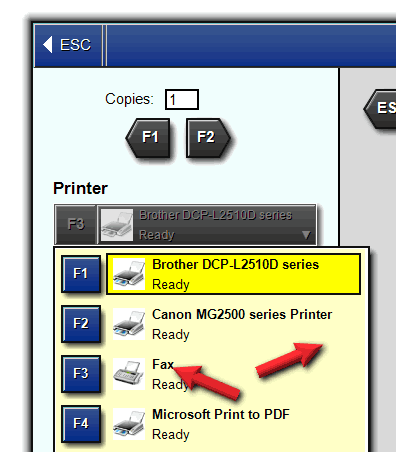
<part name="popupItemInactiveBackgroundColor" value="#D9D9D9"/>
Not used.
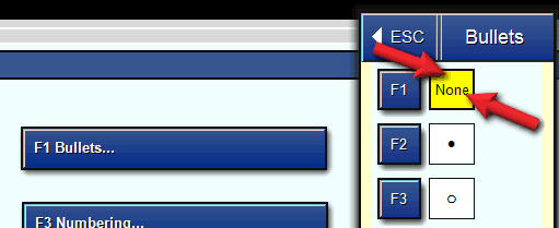
<part name="popupItemSelectedBackgroundColor" value="#FFFF00"/>
<part name="popupItemSelectedForegroundColor" value="#000000"/>
Popup item image background and foreground colour.
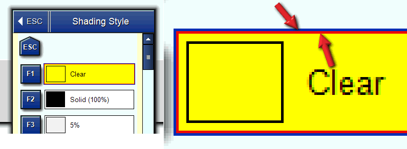
<part name="popupItemBorderInnerColor" value="#101010"/>
<part name="popupItemBorderOuterColor" value="#101010"/>
Popup item border — inner and outer colour.
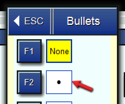
<part name="popupItemBorderInactiveInnerColor" value="#000000"/>
<part name="popupItemBorderInactiveOuterColor" value="#FFFFFF"/>
Not used.